By Karen Price
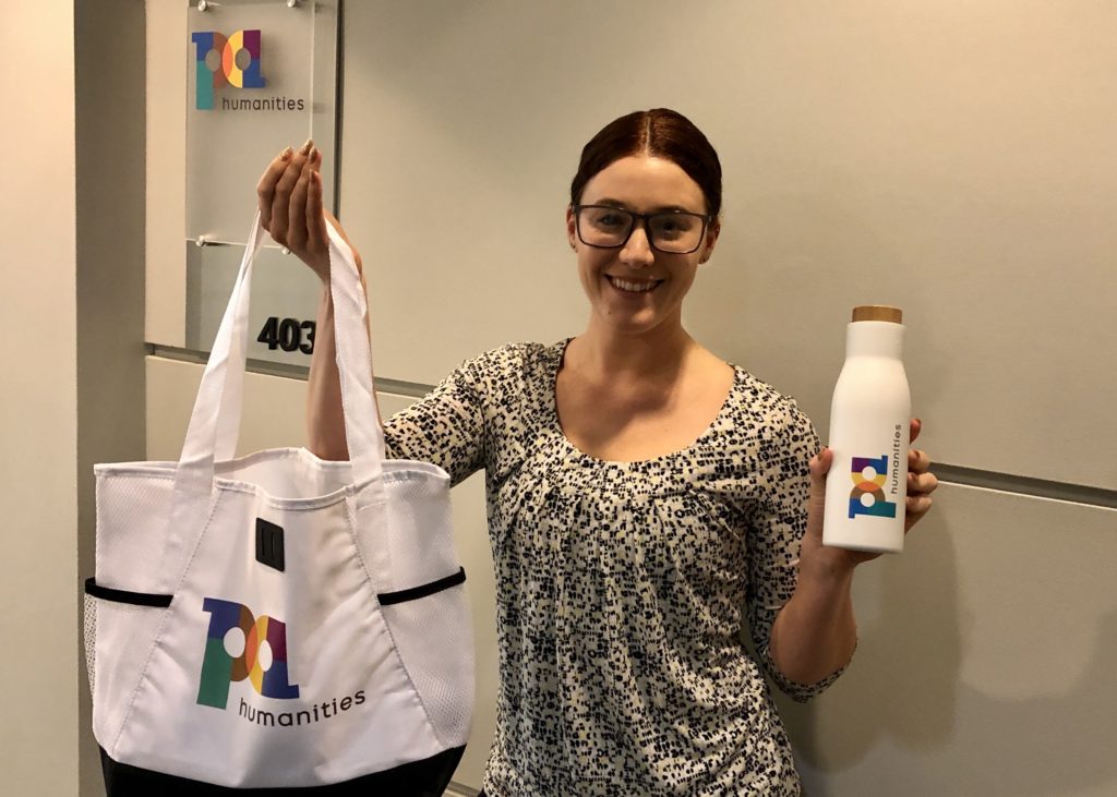
Human connection is at the very core of PA Humanities’ work, and now both the organization’s name and logo reflect that message.
The new branding, along with a new website, better represents the commitment to centering growth, equity and community to create positive and lasting change throughout Pennsylvania. It’s a welcome transformation, said Senior Director of Content and Engagement Dawn Frisby Byers.
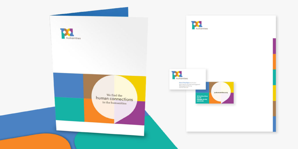
“The old brand and old name conveyed a more corporate and academic feel,” Frisby Byers said. “PA Humanities’ new brand is brighter, warmer and more inviting and better illustrates finding the human connections in the humanities as we continue to work in communities across the state.”
Formed in 1973, the organization had been known as Pennsylvania Humanities Council (PHC) since 1980 and the most recent logo featured PHC in tall, academic-looking type. The organizational priorities, however, have changed significantly over time.
In the past decade, PA Humanities has shifted from serving primarily as a grants-funding entity and supporter of local humanities organizations to focusing on community building, education and humanities advocacy. And although PA Humanities works throughout the commonwealth, it is not a state agency but rather a private nonprofit that receives a portion of its funding from the National Endowment for the Humanities.
It was time for an update to reflect the organization’s evolution, and for help PA Humanities turned to Paragraph, Inc., a Philadelphia-based branding agency.
Paragraph’s first step was to conduct research that included interviews with more than a dozen stakeholders, including staff, board members, grantees and partners, to learn more about the organization. They also compared the Pennsylvania Humanities Council name and logo to those of other humanities councils across the United States.
“(PHC) really looked out of date, and what they’re doing is so forward-thinking,” Paragraph art director Jeannine Baldomero said. “The look was making them appear like they were behind the times when, in fact, the work they’re doing is ahead of everyone else.”
Although the original plan was only to change the logo, it soon became apparent that also changing the name was essential to communicating PA Humanities’ scope of work.
“We didn’t learn until the interviews just how progressive their work was and how forward-thinking they are compared to the other councils,” copywriter Rachel Stark said. “After all that research it only made sense to update their name. Pennsylvania Humanities Council sounded so institutional and highbrow to us and didn’t seem to connect with the people they actually serve.”
The biggest change was dropping the word “council” from the name, which many similar organizations across the country had already done. That alone conveyed a more accessible feel. Humanities needed to stay in the title, but shortening Pennsylvania to PA was more conversational.
As for the logo, the themes that kept repeating throughout Paragraph’s research phase included breaking down barriers and creating connections and meaningful dialogue.
“Many people have the perception of the humanities as this purely academic endeavor and so it’s not accessible to a lot of people who don’t have access to higher education,” Baldomero said. “And a lot of the programs that PA Humanities is working on on the ground are about using the humanities in ways to unite diverse groups of communities and get them to understand each other and understand the common ground that we all stand on at the end of the day.”
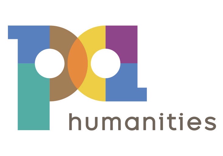
Instead of going with the two or three colors that comprise most logos, Paragraph wanted to present a broad and vibrant palette that would represent the diversity of the various communities PA Humanities serves statewide as well as the vibrancy of the work itself. The overlapping of the “P” and the “A” also has meaning.
“It creates a bright shape in the center where you’re creating something new through all this overlap,” Baldomero said.
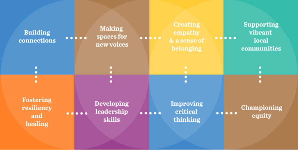
Visitors to the website will also see a change. The redesign shines the spotlight on the PA Humanities pillars and values that are at the heart of the organization’s work. Storytelling, historical perspectives, personal interpretation, creativity and deliberative conversations are the tools that the humanities provide everyday people. PA Humanities’ mission is to put the humanities in action as means to spark civic engagement, build community, educate, inspire and make long-lasting change, and redefine the role the humanities play in our lives.
“Our work is grounded in people and champions their creativity and big ideas,” Executive Director Laurie Zierer said. “We’re thrilled that our new name, logo and brand better reflect our story and values. When you look at our website, you can see human connections, diversity, boldness and uniqueness, and us creating something new with the people of Pennsylvania.”
![[color - dark bg] PA SHARP FINAL FILES DB 72dpi](https://pahumanities.org/uploads/files/elementor/thumbs/color-dark-bg-PA-SHARP-FINAL-FILES-DB-72dpi-phgl7aimtfdpzt2rscvl43ksfv3asbbls19lsvuacw.jpg "[color – dark bg] PA SHARP FINAL FILES DB 72dpi")


")